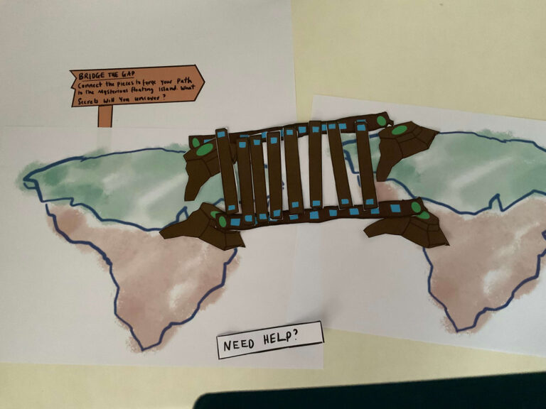
The primary objective of this assignment is for you to design and prototype an Augmented Reality (AR) application that aligns with your unique vision. By leveraging principles of immersive AR design, user interaction, and human-centered concepts, you will create an experience that seamlessly blends digital elements with the real world. Playtesting will offer essential user feedback, allowing you to iterate on your rapid AR prototype and deliver an engaging and user-friendly AR application.

Bill's Ragdoll Adventures
I created a new project called “Bill’s Ragdoll Adventures” for this week’s assignment. It’s an AR app designed to teach users about Ragdoll cats through interactive experiences with a virtual cat named Bill. The app lets users learn by interacting directly with different parts of Bill, such as his ears or paws, to get information on how to care for him. Users can also talk to Bill and see how he responds, making the experience fun and educational.
I used paper prototyping to outline the basic structure of the app quickly, using Procreate so I could easily copy and move interface assets. This method helped me map the user journey and see how people might interact with the app. Alongside the paper prototype, I created a digital proof of concept in Adobe Aero for a section of the app ‘Learn’ mode. This tool is excellent for quickly creating AR experiences and testing them in the real world.
This week, I aimed to set a solid foundation for Bill’s Ragdoll Adventures and ensure its educational and engaging quality. I focused on keeping things simple and straightforward as I developed this project!
Click Miro to to view the Cat AR Applications
Defining The AR Experience
As part of developing “Bill’s Ragdoll Adventures,” I conducted research on existing Cat AR apps. Although I found numerous apps, none specifically focused on Ragdoll cats, which presents a unique niche for my project.
Target Audience and Usage
From my research, I noticed different target audiences among the Cat AR apps:
- Apps like “Fiete Cats AR” are clearly aimed at children, with a strong emphasis on education and nurturing aspects.
- “My Cat – Virtual Pet Games” and “My Cat AR: Real Cat Simulator” are designed for a broader audience, combining elements of entertainment with a realistic pet simulation experience.
Features and Interaction
The common features I found across these apps include:
- Interaction with virtual cats through AR, allowing users to feel like they’re interacting with a real pet.
- Basic care activities such as feeding, playing, and grooming.
- The ability to take and share photos or videos of the virtual pet.
Some apps also incorporate unique elements such as:
- Educational games that teach children about pet care.
- Match-3 games and other mini-games that provide additional entertainment.
- Collections of rare items or different cat breeds that add a collectible aspect to the app.
Monetisation Strategies
Regarding monetisation, several strategies are evident:
- Many apps offer basic interactions for free but include in-app purchases for additional features, items, or experiences.
- Some have subscription options, which provide users with ongoing access to new content and exclusive features.
User Engagement and Retention
To keep users engaged and coming back, these apps use various techniques:
- Collecting mechanics where users gather different cats, toys, or accessories.
- Mini-games with levels that users can complete.
- Social sharing capabilities that allow users to post their cat’s antics on social media platforms.
User feedback is also a critical component, with features such as app ratings and support channels helping developers make iterative improvements.
This research has given me valuable insights into how “Bill’s Ragdoll Adventures” could be positioned in the market. It highlights the importance of targeting the right audience, offering engaging and interactive features, considering effective monetisation strategies, and focusing on user engagement and retention mechanisms. These elements will guide the development of a more tailored and appealing AR experience for Ragdoll cat enthusiasts.
Click Miro to to view the Seven Questions Documemt & Design Brief
User Needs and Environmental Considerations
My investigation into Ragdoll cat owner forums provided insights into what potential users are most interested in regarding Ragdoll cats. Users primarily seek information on three key areas:
Purchasing Advice: New and prospective owners often need guidance on where and how to purchase Ragdolls, what to look for in a reputable breeder, and the initial steps in welcoming a Ragdoll cat into their home.
Health and Maintenance: There’s a strong interest in understanding the specific health needs of Ragdoll cats, including diet, exercise, grooming, and common health issues particular to the breed.
Behavioural Characteristics: Posts often discuss unique behaviours of Ragdolls, such as their tendency to go limp when picked up or their playful antics like rolling down stairs.
These insights will directly influence the content and features of “Bill’s Ragdoll Adventures,” ensuring the app addresses these primary user concerns and curiosities. Additionally, I noted the app’s usability in various physical environments:
Indoor Use: The app is ideally used in home settings where users can interact with the virtual Ragdoll in a familiar environment, enhancing the pet ownership experience.
- Outdoor Use: It can also be enjoyable in garden settings, where users might simulate outdoor activities with the virtual cat, like playing or exploring.
Site Map Development
Before prototyping, I developed a site map to organise the structure of Bill’s Ragdoll Adventures. This step was crucial for envisioning the user journey through the app and determining which pages to prototype within the scope of this weekly assignment.
While only some pages will be prototyped during this assignment, the site map provides a comprehensive framework for future development. This organisational step ensures that when I move into prototyping, I have a clear plan for which parts of the app to build and test first.
Click Miro to to view User Needs research & the Site Map
Paper Protoyping & Playtesting
Objective and User Flow
I focused on developing paper prototypes for Bill’s Ragdoll Adventures, with the primary goal of testing the onboarding process and setting up the AR functionality for the app’s ‘Learn’ section. The user flow was planned to determine which pages would be included in the prototype, ensuring that the onboarding sequence was logical and user-friendly.
Creation of Paper Prototypes
Following the user flow [see Miroboard below], I created paper prototypes for each process step. This involved sketching out the interface in Procreate, which included the splash screen, main menu, and the “Learn” section users would first interact with upon starting the app. Each prototype was designed to represent the screen and options available in the app’s digital version.
I decided to type out the instructions and interface text to improve clarity and prevent any misunderstandings similar to those encountered in previous assignments. This approach ensured that all instructions were clear and easily readable, helping to simulate a more realistic user interaction during the testing phase.
Simulation and Testing
During the testing session, I acted as the ‘computer,’ responding to user inputs as they navigated through the paper prototypes. This involved simulating the app’s responses to touch and voice commands. To make the experience more realistic, I prompted testers to pick up their phone at times, mimicking the actions they would take when using the app. This method helped in evaluating three critical aspects of the app’s usability:
Efficiency: I noted how quickly the user could complete tasks such as starting the app, accessing the ‘Learn’ section, and interacting with the AR features. The aim was to ensure that users could move through the app without unnecessary delays.
Accuracy: Checking errors or misunderstandings in completing tasks was essential. This included ensuring that users understood how to navigate back and forth between different sections and could easily access the information they needed.
Satisfaction: After completing the tasks, I gathered feedback from the user on their overall experience. This included their thoughts on the ease of use, the enjoyment of the interaction, and any suggestions they had for improving the interface.
The insights gained from this paper prototyping phase are invaluable, as they provide a solid foundation for moving into digital prototyping. The feedback will refine the user interface and ensure that the app is functional and enjoyable for future users.
Click Miro to to view paper prototype documents
Findings
Background
The first participant primarily uses their smartphone for streaming, browsing Instagram, and general internet use. They are somewhat familiar with AR apps but have never used one. This background helped me understand their interactions with the AR app prototype.
Efficiency, accuracy and User Interface Design
During the paper prototype testing, the participant navigated the onboarding process quite swiftly, naturally using swiping gestures common in their regular smartphone use. However, when expected to use a ‘Start’ button to proceed after the onboarding, they continued to swipe instead. This indicated that the button was not immediately noticeable, and the participant assumed that swiping was the consistent method for navigation.
Upon reviewing the prototype, I recognised the need to incorporate essential design principles to improve visibility and usability:
Visibility of Navigation Controls: The participant did not initially see the ‘Start’ button, suggesting it blended too much with the other elements. To address this, I increased the spacing around the button to make it stand out more clearly.
Consistency in Navigation: The sudden switch from swiping to button-based navigation confused the participant. I maintained both navigation methods throughout the app to make the user interface more intuitive. This would accommodate users less comfortable with mobile gestures by providing a more familiar alternative.
Indicator Clarity: The participant mistook the onboarding progression indicators (circles) for loading symbols. These are commonly known as “progress indicators” or “pagination dots” in user interface design. I made these indicators smaller and less prominent to prevent this confusion, ensuring they focus on the main navigational controls.
Application of UX Principles: To further enhance the user interface, I applied the principle of grouping by spacing related elements closer together while keeping unrelated items further apart. This visual separation helps users like the first participant to distinguish between different types of interactions more effectively — for example, recognising a standalone ‘Start’ button versus swiping through introductory screens.
Adjustments Made
Based on the findings from this test, several adjustments were made to improve the user experience:
Dual Navigation Options: The app allows both swiping and button taps to cater to different user preferences and enhance accessibility.
Redesigned Progress Indicators: The navigation dots were resised, and their design was tweaked to ensure they are recognised as indicators, not as loading symbols.
Improved Layout and Spacing: The app’s interface has been improved by increasing the space around interactive elements, which helps highlight them and improves its overall clarity.
These changes aim to streamline the navigation experience, making it more intuitive and accommodating for all users, especially those less familiar with Mobile/AR interfaces.
UI Before & after Playtesting
Simplicity and Usability
The participant appreciated the simplicity of the app’s interface and functionality. They emphasised that the straightforward design made the app easy to use, and they preferred not to have additional details or complexity that could potentially clutter the experience. This feedback validates the design direction, affirming that the minimalist approach is effective for this type of AR application.
Privacy and Transparency Concerns
An important piece of feedback related to privacy and transparency regarding the app’s use of the camera. The participant suggested enhancing the communication about the camera usage within the app. They recommended specifying in the camera permission popup that the app only accesses the camera while it is being actively used, not at any other time.
Implementing Changes
Based on this suggestion, I plan to update the camera permission popup to clearly state that the camera is only used during active app sessions. This adjustment will help reassure users about their privacy and enhance trust in the app, ensuring they feel secure about how their data is being used.
This feedback is crucial as it highlights the need for clear communication about privacy, a significant concern for many users today. Incorporating this change will not only improve user satisfaction but also align with best practices for user privacy and transparency in mobile applications.
Participant 2 - Bill the ragdoll was happy with his AR experience!
Prototyping in Adobe Aero
Creating a prototype in Adobe Aero for Bill’s Ragdoll Adventures was a fun process that involved several key steps, from finding 3D models to interactive design.
Selecting the 3D Model
I started by selecting an appropriate 3D model of a cat that could serve as the central feature of our AR scene. While the model wasn’t rigged, which limited my ability to animate it at this stage, it provided a solid foundation for the static AR experience. Exploring rigging and animation will be an exciting avenue for future iterations, allowing for more dynamic interactions.
Integrating the Model into Adobe Aero
After choosing the model, I imported it into Adobe Aero. This step was crucial as it set the stage for adding interactivity.
Designing UI Assets
Using Figma, I created the UI assets that included instructions for caring for a Ragdoll cat.
Step 4: Placing UI Assets in Adobe Aero
Once the UI assets were ready, I placed them into the Adobe Aero scene. This involved adjusting their positions relative to the 3D cat model to ensure they were easily accessible and readable within the AR environment.
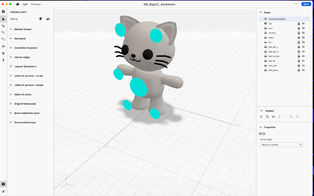
Creating Interactive Hotspots
I added interactive hotspots over the cat model in the Aero scene (these hotspots would be marked by animated particles, designed to gently pulse or glow when not interacting with them if the app was to be developed). This subtle animation would serve as a visual cue to prompt users to tap on them and discover the care instructions.
Adding Behaviours for Interactivity
The next step involved adding behaviours to the hotspots and UI elements to make the AR scene interactive:
Visibility Settings: Initially, I set the visibility of the instructional UI to hidden.
Interaction Logic: When a user taps a hotspot (marked by a blue dot), the corresponding instructions animate into view, and the blue dot hides. This ensures the focus remains on the instructional content.
Toggle Visibility: Tapping the instructional content itself hides it again, and the blue dots reappear, ready for further exploration.
Whilst exploring Aero’s features, I discovered the ability to add URLs. This gave me an idea – I could use Amazon’s affiliate program to promote Ragdoll/Cat-related products and potentially generate additional revenue.
Testing and Iteration
Next, before sending to a mobile device, I used Areo’s ‘Preview’ feature to test that the interactions I had set up worked… they did 🥳!
Testing within Mobile
Testing the scene on a mobile device, I noticed some practical issues with the initial UI design. The care instruction panels were initially quite wide, which forced users to pan significantly to the left or right. This movement detracted from the immersive experience, pulling the user’s focus away from the central scene featuring the cat.
Adjustments Made:
- Panel Resising: To address this, I revised the dimensions of the UI panels. I reduced their width and increased their length slightly. This adjustment ensured that the information could be read more comfortably without requiring users to move away from viewing the central AR scene. I also added a close icon to each of the panels.
- Enhancing Interactivity: To enrich the interactive experience, I incorporated audio cues and responsive animations. These were activated when users touched the cat (grey area) or moved closer within the AR space. I wanted to explore other trigger capabilities.
Prototyping in Adobe Aero
Adobe Aero proved to be an intuitive tool for building AR experiences. It allowed for seamless integration of 3D models and 2D UI elements, making it relatively straightforward to layer interactive components. Its user-friendly interface facilitated rapid prototyping, especially helpful for designers new to AR.
This project was a deep dive into the practicalities of AR prototyping and an exploration of how AR can be used to educate and engage users in specific topics like pet care. I plan to explore more complex animations and interactions in future projects, possibly integrating motion design to bring the 3D model to life more engagingly.
Next, I would like to try to recreate this in Unity!
This portfolio piece highlights my approach to integrating multiple design tools and technologies to create a cohesive and interactive AR experience. The project underscored the importance of user-centric design and iterative testing.
Setting Up the AR Environment in Unity
This week, I decided to continue my XR exploration within Unity. The first step was setting up the project for Android and iOS platforms.
Unity Installation and Project Initiation
The goal was to set up an AR project from scratch (following the provided weekly materials), so I chose the 3D Universal Render Pipeline (URP) template due to its efficiency and suitability for mobile applications. Once I named and created my project, I was ready to configure it for Android.
Configuring for Android
The first step involved switching the project’s platform to Android through the Build Settings. Afterwards, I opened the Package Manager to install essential packages for AR development, starting with AR Foundation and then the Google ARCore XR Plugin. It was crucial to ensure that the versions of AR Foundation matched the ARCore Plugin to prevent compatibility issues.
After installing the necessary plugins, I tweaked the project settings. This included activating XR Plugin Management and setting up the ARCore Plugin under the Android section. To ensure proper AR display, I adjusted the URP settings to enable AR background rendering features, adapting it for augmented reality environments.
Transition to iOS
Switching the platform to iOS was straightforward. I changed the target platform to iOS in the Build Settings, ensuring that all the necessary AR packages were installed, including AR Foundation and Apple ARKit XR Plugin. Under the XR Plugin Management for iOS, I activated the Apple ARKit to enable AR functionalities.
In the Player Settings, I set up unique identifiers and configurations specific to iOS, such as the Bundle Identifier and camera permissions, which are crucial for App Store requirements. I also ensured that the ARKit support was enabled, allowing the application to utilise iOS’s AR capabilities.
Final Adjustments and Build Preparation
My final task was ensuring that both platforms were ready for deployment. This involved setting the graphics API and confirming the API level compatibility for Android. For iOS, I prepared the project for Xcode integration, setting up the necessary settings to ensure smooth functionality on Apple devices.
This process in Unity prepared my AR application for a dual-platform launch and deepened my understanding of the technical and practical aspects of AR development across different mobile ecosystems.